top of page


Redesigning Money Tracker :
Simplifying Finances, Empowering Users
UI/UX Case study
UI/UX Case study
Mobile App


Tools Used!


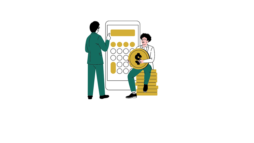
Project Overview

Money Tracker is a personal finance app designed to help users manage their income, track expenses, and gain insights into their spending habits. The goal of this redesign was to enhance the app's visual appeal, simplify its functionality, and create a seamless user experience that empowers users to take control of their finances.
Problem Statement
Users found the previous version of Money Tracker to be visually outdated and confusing.
The category section is complex.
1
2
Recent transactions were hard to track.
3
Users struggled to find accurate category to add their expenses.
4
Goals & Objectives
Improve the app's visual design with a modern logo and color scheme.
Clearly display income, expenses, and total balance on the home screen.
Simplify add and category selection.
Enhance onboarding pages to highlight app features.
Design easy sign-in and sign-up pages for easy user access.

Design Thinking Process

EMPATHIZE
IDEATE
User Persona
Journey Map
Empathy Map
Research
Survey
User Interview
Brainstorming
Card Sorting
User Flow
Wireframes
Visual Design
Prototype
PROTOTYPE
DEFINE
Project Timeline
UX Research
UI Design
EMPATHIZE
DEFINE
IDEATE
PROTOTYPE
Day 1
Day 3
Day 5
Day 7
Day 8
Day 14
Research Process

User Research
We conducted user interviews and surveys to gather insights about pain points and expectations.
Key Insights
Clarity Matters
Users wanted a more intuitive home screen displaying their financial overview at a glance.
Category Confusion
Many found the previous category options too detailed and unorganized.
Receipt Tracking
Users expressed a need to upload receipts to avoid forgetting what they spent money on.
Visual Data
A desire for simple, interactive graphs to show how money was being spent monthly.
Quantitative Research
Quantitative research is a method used to collect and analyze numerical data to identify patterns, relationships, and trends. This research focused on Surveys about users’ shopping habits, favorite fashion platforms, and struggles with online shopping.


1. How often do you track your daily expenses?
Daily
Weekly
Monthly
Rarely
Which feature do you find most useful in a money tracking app?
Income and expense overview
Category organization
Visual charts (like pie charts)
Receipt upload


3. How would you rate the clarity of financial data (income, expenses, balance) in the app?
Very clear
Somewhat clear
Neutral
Confusing
Would you use a receipt upload feature to log expenses?
4.
Yes, always
Sometimes
Rarely
Never
Key Insights
1
2
3
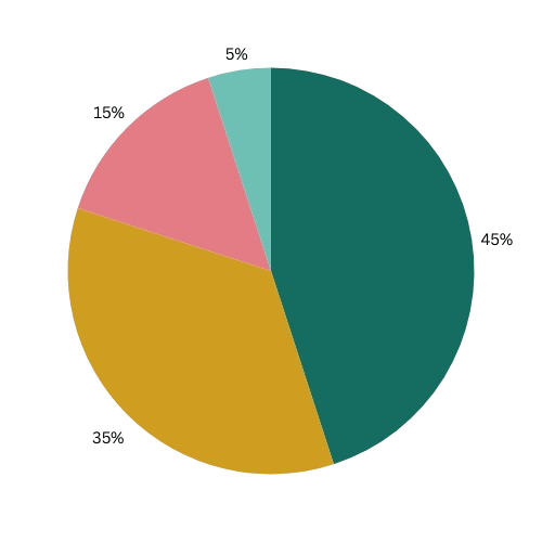
30% of users preferred pie charts, highlighting the importance of clear data visualization.
80% of users found financial data either very clear or somewhat clear after the redesign, validating the improved home screen layout.
45% of users expressed strong interest in using the simple receipt upload feature, reinforcing the value of this new addition for better expense tracking.
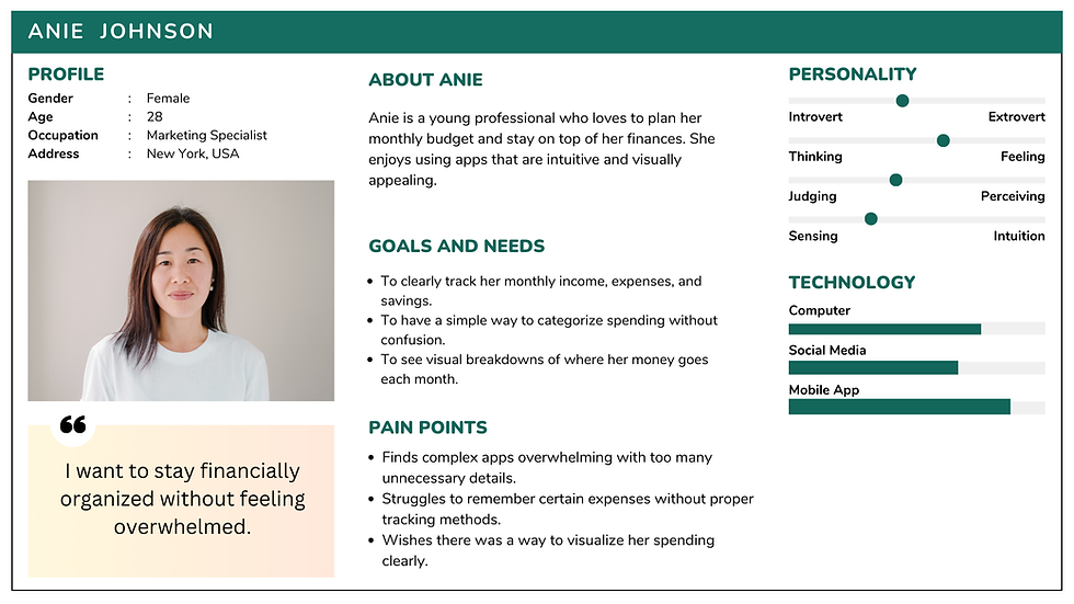
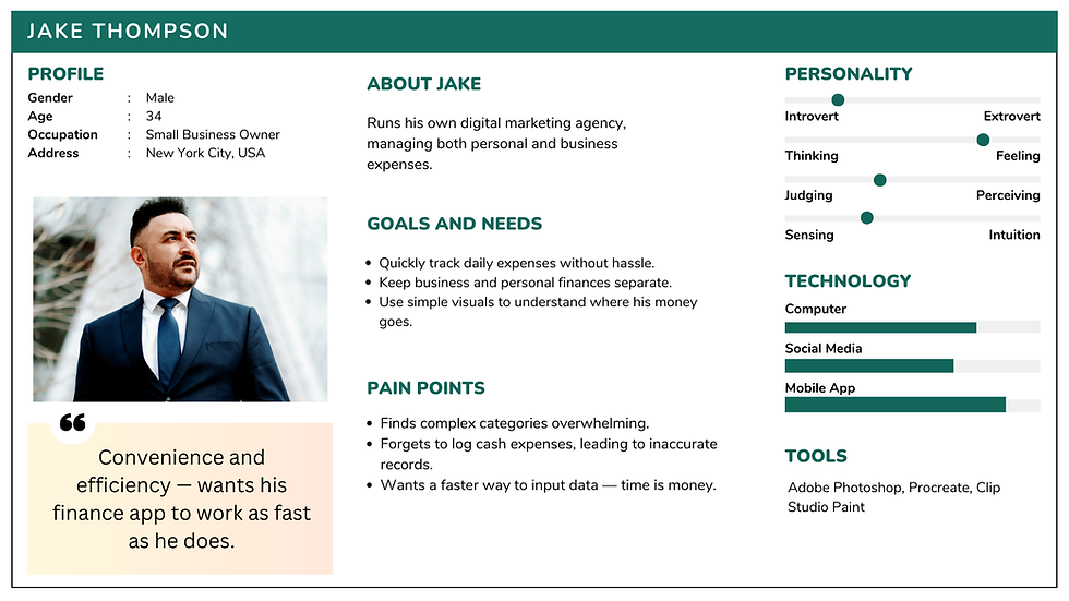
User Persona
A user persona is a fictional profile representing your target user, based on research. It includes details like age, goals, pain points, and behaviors to help designers understand user needs. Personas keep the design process user-focused, ensuring solutions align with real user expectations.
Persona: Anie – Marketing Specialist
Persona: Ryan – Small Business Owner
High-Fidelity Wireframes

Problem 1: Logo wasn’t visually attractive
The previous Money Tracker logo lacked visual appeal and failed to convey the app's core purpose. To create a stronger brand identity, we redesigned the logo with a more modern and meaningful concept.
The new logo features an owl with a calculator — symbolizing wisdom and financial awareness. The owl reflects the app's goal of helping users make smart financial decisions, while the calculator emphasizes practical money management. The design uses clean lines and a balanced color palette to maintain simplicity yet stand out in a crowded market.
This redesign not only improves visual appeal but also aligns with the app's mission: empowering users to track and control their finances confidently.
Before:

After:
Problem 2: Don’t know all the features
Previously, the app opened directly to the home screen, leaving users confused about its features. To address this, I added a new onboarding UI — a simple 3-step flow to introduce key features:
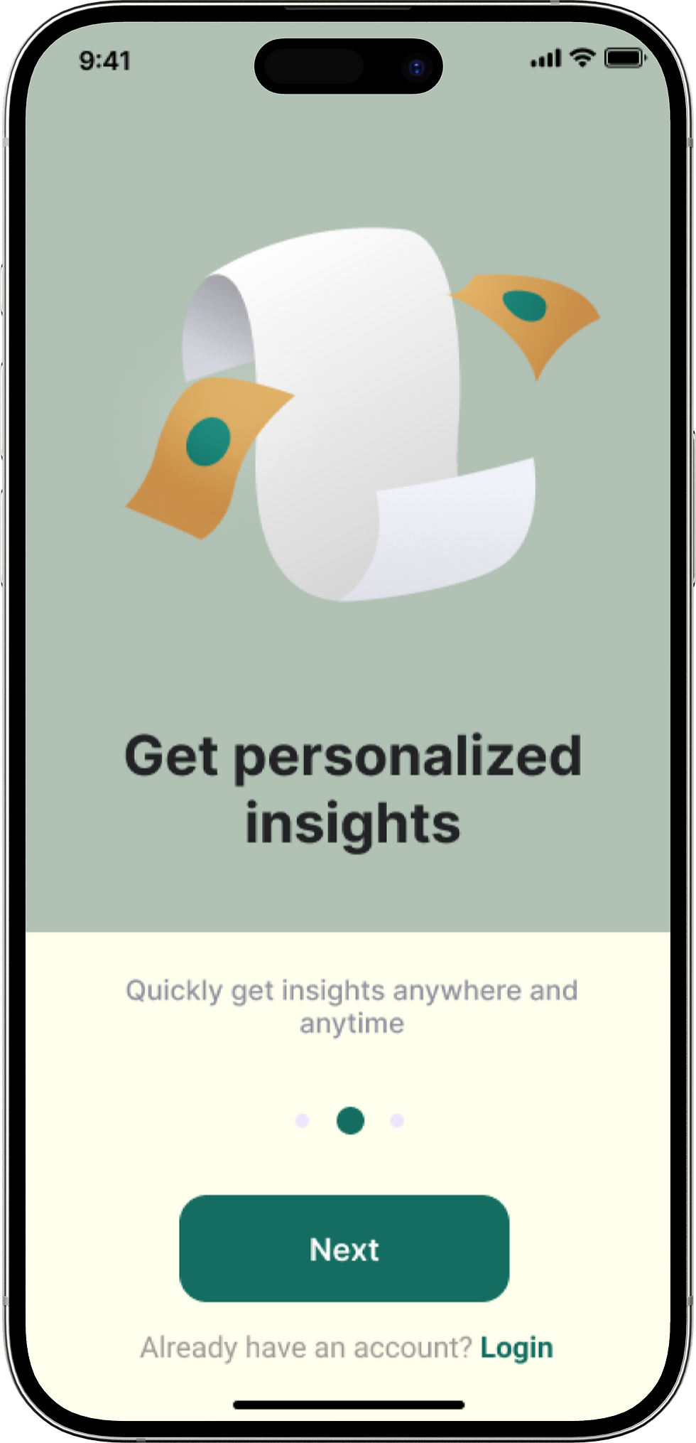

This clear and concise onboarding experience ensures users immediately understand the app’s core benefits and how to use them.
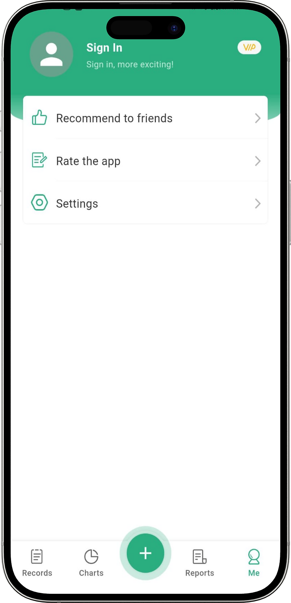
Problem 3: Confusing sign in /sign up
Before:
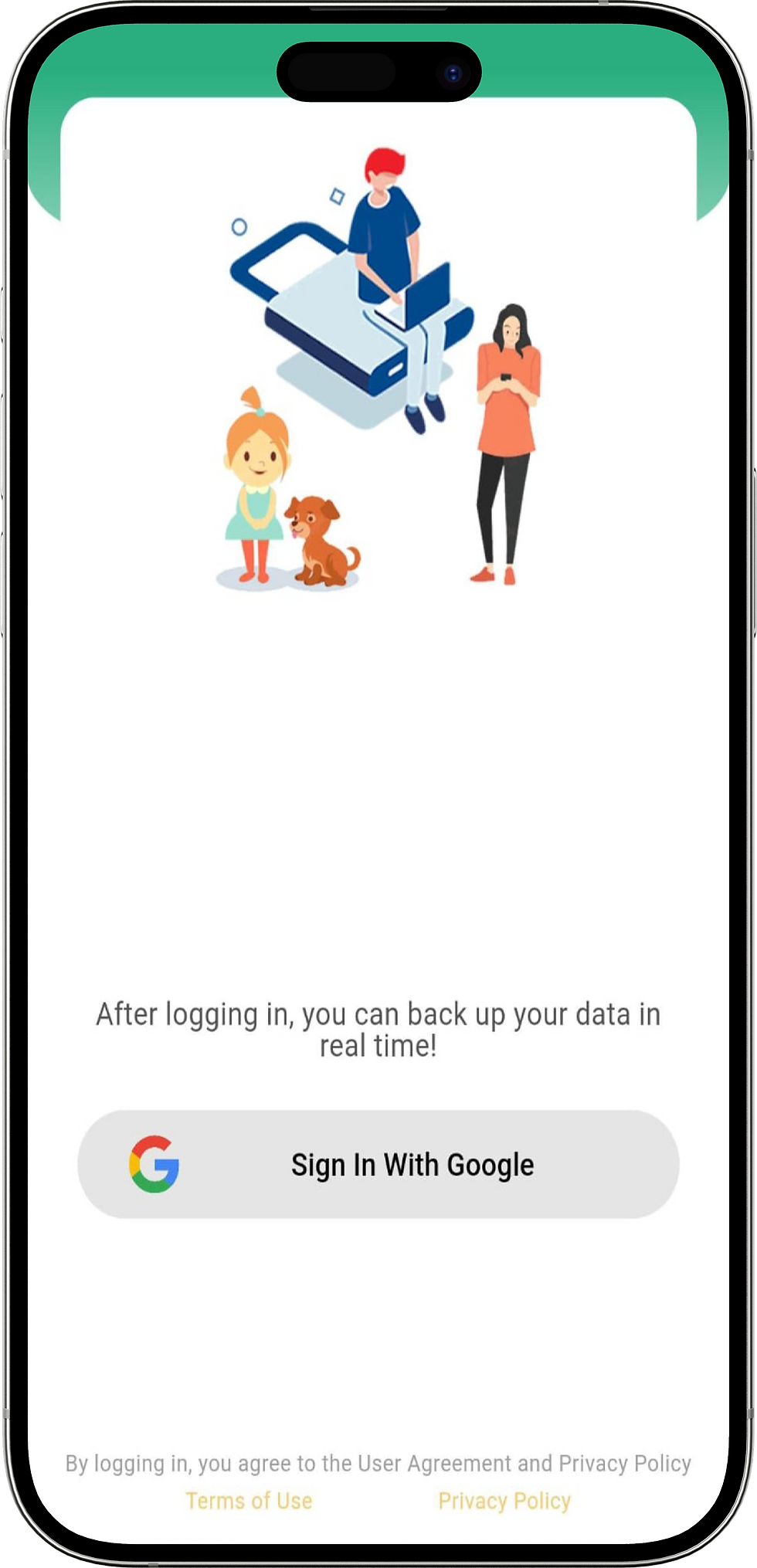
The previous app version did not have a proper sign-in or sign-up flow. Users could use the app without logging in and would only see the option to sign in through Google after accessing the account section, leading to confusion about whether their data was being saved.

In the redesign, I added dedicated Sign-In and Sign-Up pages that appear after the onboarding flow. This allows users to clearly understand that they need to log in or create an account to securely save their data. The new flow is simple, with minimalist design elements, clear input fields, and easy Google authentication.
After:

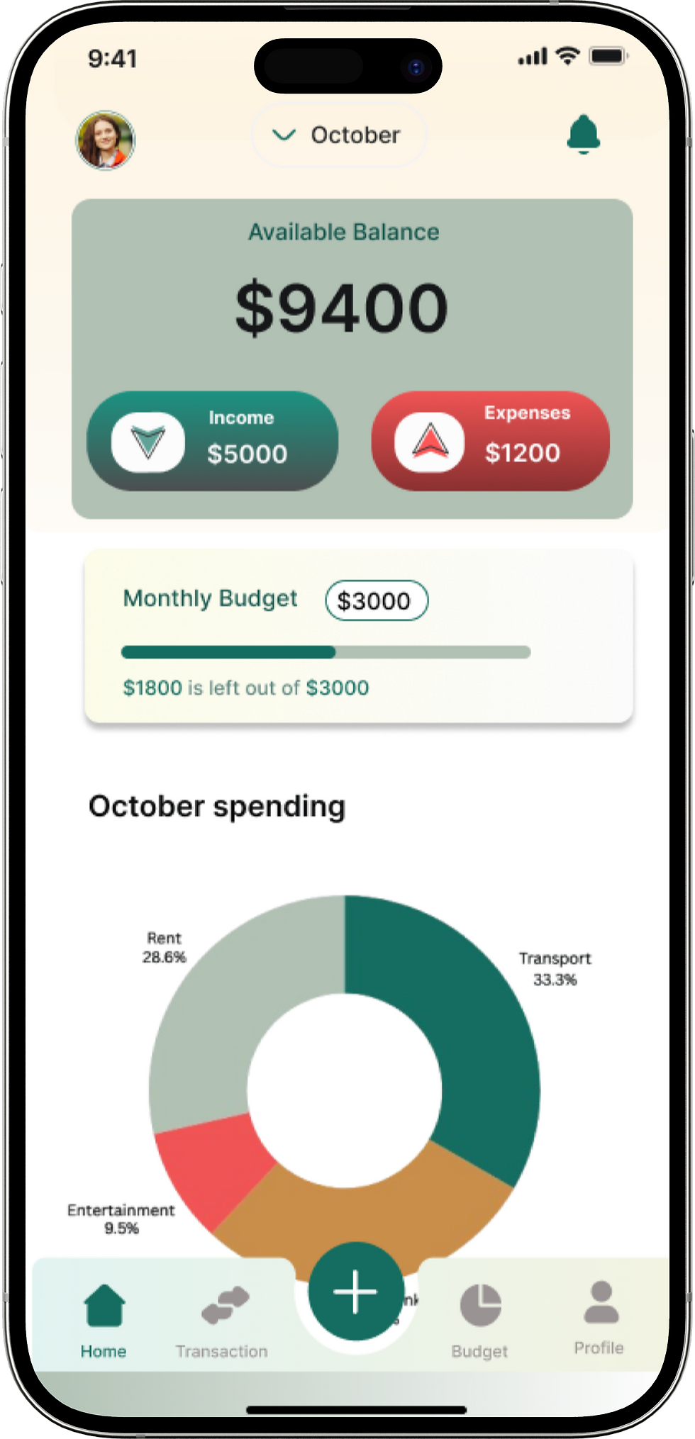
Problem 4: Unorganised home screen
Before:

The home screen was cluttered and lacked a clear financial overview. Users couldn’t easily grasp their income, expenses, or remaining balance for the month. There was no visual representation of spending, making it hard for users to identify which categories consumed most of their budget.
After:
Clear Financial Overview: Income, expenses, and total balance displayed prominently.
Donut Pie Chart: Visual breakdown of spending categories for the current month.
Monthly Budget: Clearly shows how much money the user has left to spend in a given month, helping them stay on track.
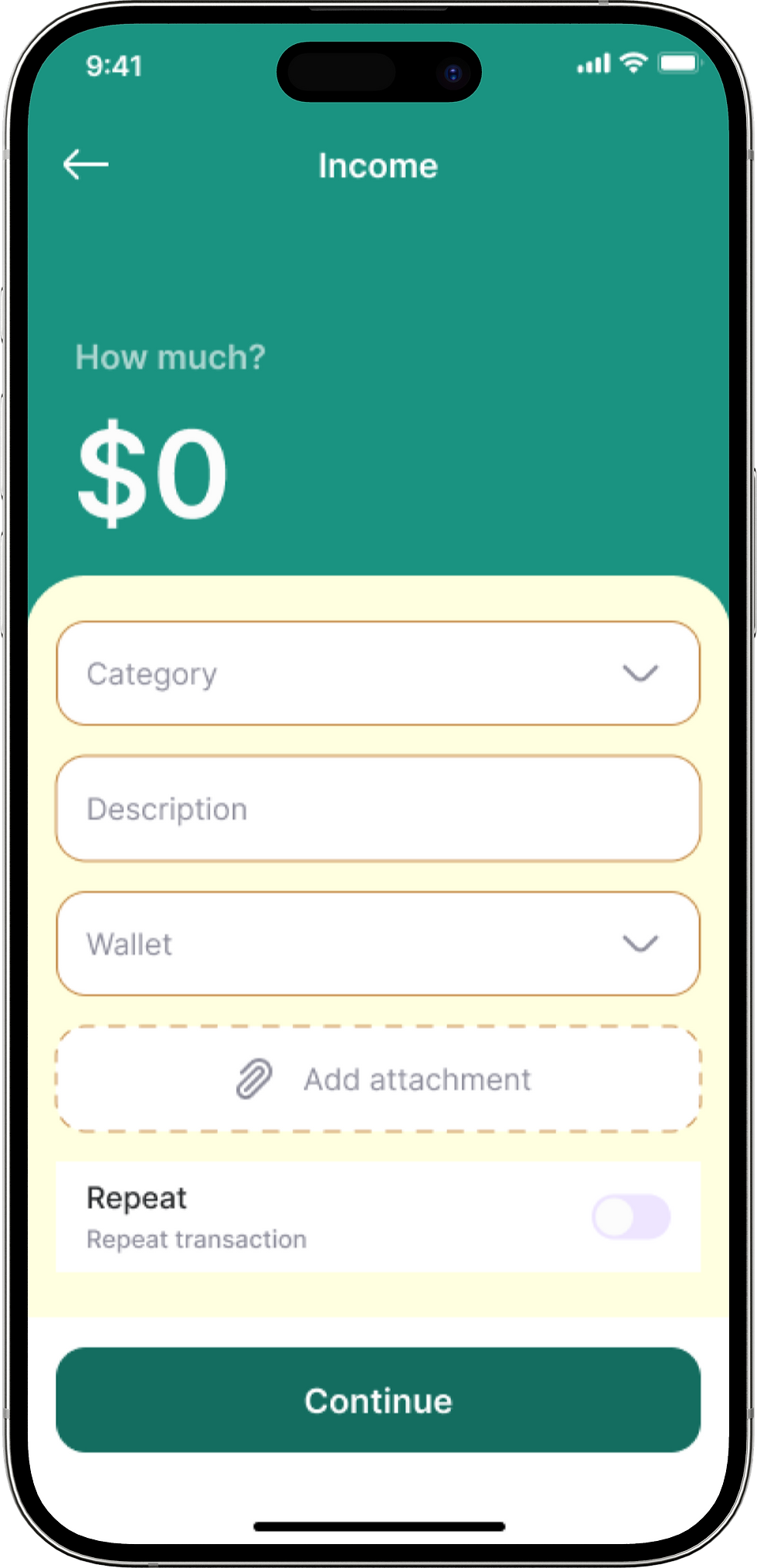
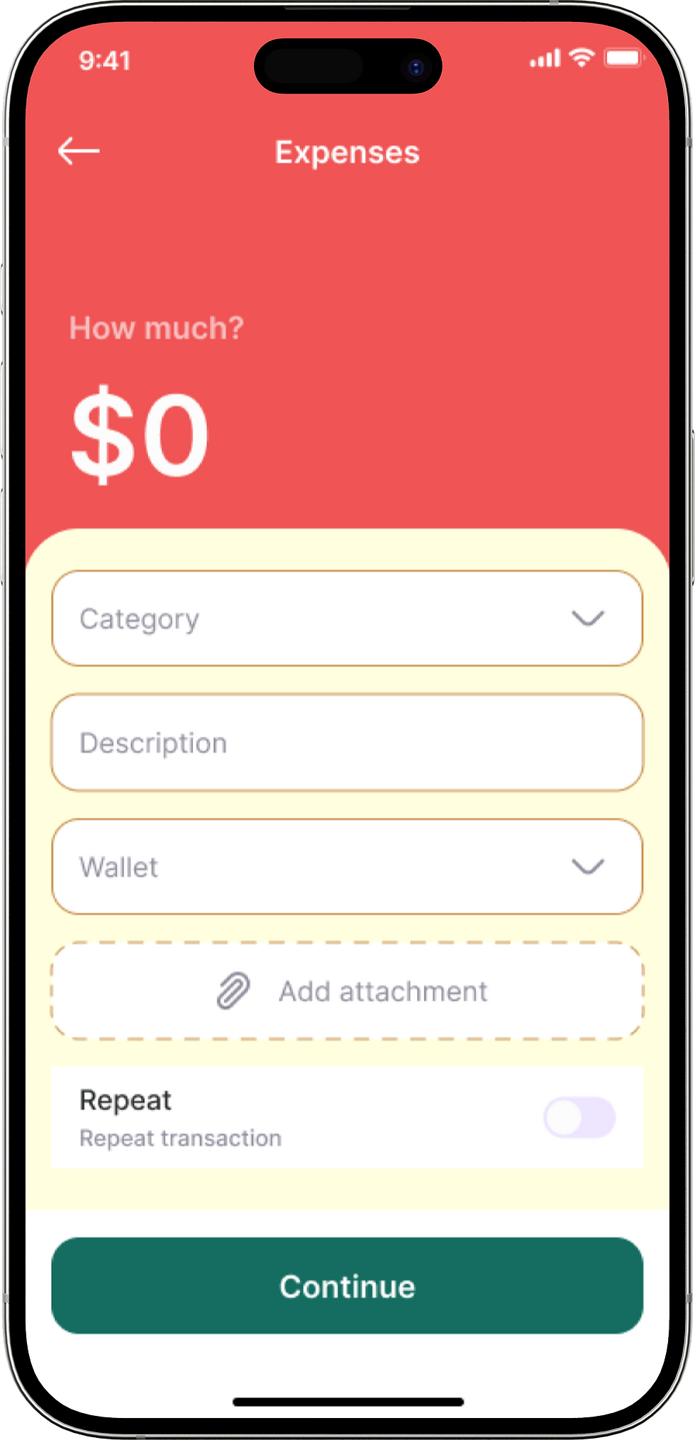
Problem 5: Difficult UI design for ‘ADD’
Previously, users struggled with a cluttered expense-adding experience. The new Add Money feature streamlines the process:
Single Add Button: Users simply tap Add to choose between adding expenses, income, or uploading a receipt.
Receipt Upload: Camera integration for capturing receipts instantly.
Simplified Category Selection: dropdown options make it easy to classify expenses.
Intuitive Input Fields: Clear and user-friendly amount, date, and category selection.
Before:


After:
bottom of page